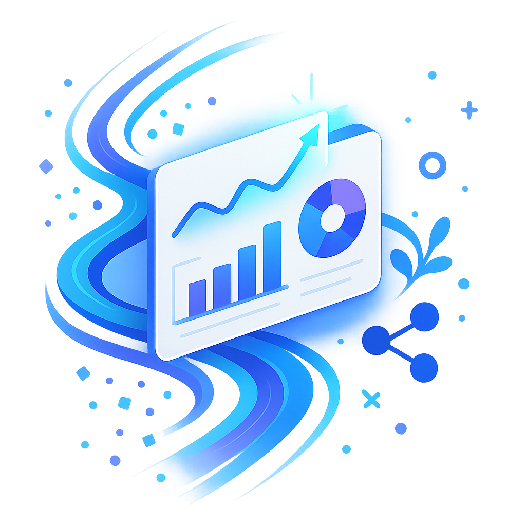
Dashflow
Turn Data Into Instant Action
Dashflow turns scattered business data into interactive dashboards for small-business managers in retail and services, eliminating spreadsheet headaches. Its intuitive drag-and-drop interface and instant chart recommendations highlight trends in minutes, empowering non-technical teams to create, share, and act on insights quickly—no coding, training, or complex tools required.
Subscribe to get amazing product ideas like this one delivered daily to your inbox!
Product Details
Explore this AI-generated product idea in detail. Each aspect has been thoughtfully created to inspire your next venture.
Vision & Mission
- Vision
- To empower every small-business leader to unlock data-driven growth and inspire change with effortless, insightful storytelling for all.
- Long Term Goal
- By 2028, empower one million small-business managers worldwide to boost decision-making speed and team collaboration by 75% through effortless, data-driven insights—no technical skills required.
- Impact
- Reduces dashboard creation and sharing time by over 75% for small-business managers, enabling 60% more non-technical users to generate actionable insights and improving decision-making speed, transparency, and team collaboration across retail and services operations.
Problem & Solution
- Problem Statement
- Small-business managers in retail and services spend hours wrangling spreadsheets to visualize data and share insights, but existing BI tools are too complex for non-technical users, leaving crucial business decisions slow, opaque, and inconsistent.
- Solution Overview
- Dashflow’s intuitive drag-and-drop interface lets small-business managers instantly transform raw data into interactive dashboards, while auto-insights intelligently recommends charts and highlights key trends—eliminating spreadsheet frustration and making data-driven decisions fast, clear, and accessible for every team member, no technical skills needed.
Details & Audience
- Description
- Dashflow empowers small-business managers and team leads to turn raw data into interactive dashboards in minutes. It eliminates spreadsheet headaches and speeds up decision-making for non-technical professionals. With its unique auto-insights, Dashflow instantly recommends the best charts and highlights trends, letting users create and share compelling data stories—no coding, extra tools, or training needed.
- Target Audience
- Small-business managers (30-55) in retail or services needing effortless, instant data insights and quick team sharing.
- Inspiration
- Sitting with a sales manager, I watched her wrestle with endless Excel tabs, painstakingly piecing together charts for a morning meeting. Her frustration grew as she tried to explain hidden trends lost in rows of numbers. That moment, seeing vital business insights buried and her story unheard, sparked the vision for Dashflow—making data instantly visual, interactive, and easy for every manager to share and understand.
User Personas
Detailed profiles of the target users who would benefit most from this product.
Time-Torn Tina
- Age 35, suburban salon owner - Bachelor's in cosmetology, 5 years experience - Annual revenue ~$250k, 5 employees - Married with one child, busy lifestyle
Background
Tina started as a stylist and opened her salon 3 years ago, struggling to balance chair time and paperwork. She taught herself basic Excel but finds it overwhelming, so she craves tools that lighten her admin load.
Needs & Pain Points
Needs
1. Instant daily revenue summary for quick schedule adjustments 2. Automated inventory alerts before supplies run low 3. Simple staff performance metrics to optimize rota
Pain Points
1. Lost bookings due to manual schedule errors 2. Wasted supplies from unnoticed inventory depletion 3. Late admin tasks cutting into client time
Psychographics
- Craves efficiency to maximize client time - Values intuitive tools over complex features - Feels anxious about forgotten appointments - Motivated by work–life balance improvements
Channels
1. Instagram Business (favorite updates) 2. Facebook Groups (salon owners) 3. WhatsApp (team chat) 4. Google Search (tool research) 5. Email Newsletters (industry tips)
Metric-Minded Maya
- Age 29, urban café manager - Degree in hospitality management, 3 years experience - $180k annual revenue, team of 4 baristas - Single renter living downtown, tech-savvy
Background
Maya rose from barista to manager, driven by curiosity about customer habits. After struggling with inconsistent spreadsheet reports, she seeks a tool that visualizes data without coding so she can optimize menu offerings quickly.
Needs & Pain Points
Needs
1. Real-time footfall vs. sales correlation charts 2. Simplified analysis of menu item performance 3. Automated daily sales trend notifications
Pain Points
1. Delayed spreadsheet exports masking sales patterns 2. Manual data merging eats into prep time 3. Inconsistent footfall counts disrupt staffing decisions
Psychographics
- Obsessive about data-driven menu tweaks - Thrives on near-instant actionable insights - Prefers visual trends over raw numbers
Channels
1. Instagram Stories (inspiration) 2. TikTok (cafe trend research) 3. LinkedIn Learning (skill-building) 4. Google Analytics (web insights) 5. Email Digest (daily summary)
Optimization Oscar
- Age 42, online retail store owner - MBA in marketing, 7 years e-commerce experience - $500k annual sales, manages 2 warehouses - Suburban family man, father of two
Background
Oscar transitioned from corporate marketing to launch his niche gadgets store. Frustrated by fragmented sales and ad data, he seeks unified dashboards to optimize stock and PPC budgets in real time.
Needs & Pain Points
Needs
1. Real-time stock level and sales alerts 2. Unified ad spend and ROI metrics 3. Easy SKU performance comparisons
Pain Points
1. Stockouts causing lost sales revenue 2. Disconnected ad platforms complicating budget allocation 3. Time-consuming manual data consolidation
Psychographics
- Lives for optimizing ROI on every dollar - Trusts visual cues over spreadsheets - Enjoys rapid A/B campaign testing
Channels
1. Google Ads Dashboard (campaign data) 2. Shopify Analytics (store metrics) 3. Facebook Ads Manager (ad spend) 4. Slack (team notifications) 5. Email Reports (daily summaries)
Data-Curious Casey
- Age 31, mobile repair service founder - Vocational diploma, 4 years self-employed - $200k annual revenue, 3 technicians - Rents office, travels citywide
Background
Casey launched his repair van to fill after-work demand. With inconsistent paper logs, he craves an intuitive dashboard to predict busy hours and reduce customer wait times.
Needs & Pain Points
Needs
1. Clear daily demand peak hour indicators 2. Technician availability and wait-time overlays 3. Simple mobile-friendly dashboard access
Pain Points
1. Paper logs hiding true peak repair times 2. Scheduling conflicts frustrating customers 3. Difficulty tracking service type popularity
Psychographics
- Driven by curiosity to uncover hidden trends - Values simplicity over feature overload - Fears overbooking technicians during peak hours
Channels
1. WhatsApp Business (customer chat) 2. Google Maps (service area research) 3. Facebook Ads (local promotion) 4. Instagram (portfolio showcase) 5. Email (order confirmations)
Dashboard-Doubter Dan
- Age 38, first-time retail owner - Bachelor's in business, 1 year ownership - $120k revenue, 2 part-time employees - Lives downtown, average tech skills
Background
Dan left corporate retail to open a boutique. Overwhelmed by analytics jargon and complex interfaces, he seeks reassurance that a dashboard will simplify, not complicate, his operations.
Needs & Pain Points
Needs
1. Clear onboarding with guided chart tutorials 2. Pre-built templates for immediate insights 3. Step-by-step setup without technical jargon
Pain Points
1. Overwhelming setup deterring further exploration 2. Jargon-laden reports causing confusion 3. Fear of hidden costs or complexity
Psychographics
- Hesitant about technical tools without guidance - Seeks quick wins to build confidence - Values straightforward, jargon-free interfaces
Channels
1. YouTube Tutorials (step-by-step guides) 2. Email Support (setup assistance) 3. Facebook Groups (peer advice) 4. Google Search (basic queries) 5. In-app Tour (feature walkthroughs)
Product Features
Key capabilities that make this product valuable to its target users.
AutoTune Alerts
Leverages historical data to automatically adjust alert thresholds based on patterns and seasonality, ensuring notifications remain relevant and reducing false alarms.
Requirements
Historical Data Ingestion and Processing
Description
The system must connect to and ingest historical business data from multiple sources (e.g., POS systems, spreadsheets, CRM) then clean, normalize, and store it in an optimized time-series schema for analysis. This module ensures data integrity by handling missing values, anomalies, and data type conversions, providing a solid foundation for accurate pattern recognition and threshold tuning by AutoTune Alerts.
Acceptance Criteria
Dynamic Threshold Calculation Engine
Description
Automatically calculate optimal alert thresholds using statistical analysis and adaptive algorithms that learn from past performance. This engine periodically evaluates incoming and historical data to update thresholds, reducing false positives and ensuring alerts remain relevant as business conditions change.
Acceptance Criteria
Seasonality Detection Module
Description
Implement a seasonality detection component that analyzes time-series data to identify recurring patterns (daily, weekly, monthly) and adjusts threshold calculations to account for expected fluctuations. This ensures alerts differentiate between normal seasonal changes and true anomalies.
Acceptance Criteria
User Calibration and Feedback Interface
Description
Provide an intuitive dashboard interface where users can review AutoTune-suggested thresholds, accept or modify recommendations, and submit feedback. This interface should include visual comparisons of historical vs. current thresholds and options to fine-tune alert sensitivity, enhancing user trust and customization.
Acceptance Criteria
Alert Performance Monitoring Dashboard
Description
Deliver a monitoring dashboard that tracks key performance metrics for AutoTune Alerts, such as false positive/negative rates, threshold drift, and alert response times. The dashboard should highlight anomalies in model performance and trigger notifications when retraining or manual intervention is needed.
Acceptance Criteria
Severity Tags
Assigns color-coded priority badges (e.g., critical, warning, info) to each alert, helping managers triage issues at a glance and focus on the most urgent KPIs.
Requirements
Tag Assignment Interface
Description
Provide an intuitive interface within the alert dashboard to assign predefined severity badges (critical, warning, info) to each alert. The interface should support drag-and-drop or a dropdown selector, display color-coded tags prominently next to alert titles, and update in real time without a full page reload. Users must be able to assign or change severity levels with minimal clicks, ensuring quick triage and consistent tagging across all alerts.
Acceptance Criteria
Severity Category Configuration
Description
Enable administrators to define, customize, and manage severity categories including naming, color selection, and default thresholds. The configuration panel should allow adding new categories or editing existing ones with a live preview of badge appearance. All changes must propagate to existing alerts and be stored persistently, ensuring the tool adapts to each business’s unique prioritization policies.
Acceptance Criteria
Severity Tag Filtering
Description
Implement filtering controls that allow users to view alerts by severity tag. Users should be able to select one or multiple severity levels via checkboxes or a dropdown filter and see the dashboard dynamically update to show only matching alerts. The filter state should persist across sessions, enabling managers to focus on critical metrics without distraction from lower-priority items.
Acceptance Criteria
Bulk Severity Tag Update
Description
Provide multi-select capabilities for alerts, enabling users to select multiple items simultaneously and apply a single severity tag to all selected alerts in one action. The bulk update operation should trigger a confirmation prompt and display a progress indicator. This feature streamlines the tagging process for large sets of alerts, reducing repetitive tasks and ensuring consistent prioritization.
Acceptance Criteria
Critical Tag Notification
Description
Automatically generate real-time notifications or email alerts when a new alert is tagged as ‘Critical.’ Notification settings should allow users to opt in or out per channel and configure frequency thresholds (e.g., immediate, hourly digest). Notifications must include context such as alert name, timestamp, and current value to ensure managers are immediately aware of high-priority issues requiring prompt attention.
Acceptance Criteria
OmniNotify
Delivers alerts across multiple channels—including SMS, email, Slack, and push notifications—so teams stay informed through their preferred communication tools without missing a critical update.
Requirements
Multi-Channel Delivery
Description
Implement a unified notification engine that supports sending alerts via SMS, email, Slack, and mobile push notifications. The system must integrate with external communication providers (e.g., Twilio, SendGrid, Slack API, Firebase Cloud Messaging), handle channel-specific formatting, and route messages based on user preferences. It should ensure seamless integration within Dashflow’s architecture, allowing alerts triggered by dashboard events to be automatically dispatched across all configured channels.
Acceptance Criteria
Customizable Notification Triggers
Description
Provide a flexible rule builder that allows users to define custom alert conditions based on dashboard metrics, thresholds, and time windows. Users should be able to combine multiple criteria (e.g., sales drop below $1,000 AND inventory above threshold) and select which channels to notify. The feature must validate trigger logic, store rules securely, and evaluate conditions in real time.
Acceptance Criteria
User Preference Management
Description
Develop a user interface within Dashflow settings where each user can configure their notification preferences, including selecting preferred channels, setting quiet hours or do-not-disturb periods, and opting in or out of specific alert types. Preferences should be stored per user, applied at send time, and synchronized across web and mobile clients.
Acceptance Criteria
Notification Template Editor
Description
Build a template management system allowing users to customize the content and formatting of alerts for each channel. The editor should support placeholders for dynamic data (e.g., {{metric_name}}, {{threshold_value}}, {{timestamp}}), basic styling, and preview functionality. Templates must be saved, versioned, and applied automatically when alerts are generated.
Acceptance Criteria
Delivery Reliability and Retry Mechanism
Description
Implement a robust delivery pipeline with queueing, retry logic, and failure handling for all channels. The system should queue outgoing notifications, attempt retries on transient failures with exponential backoff, log persistent errors, and provide visibility into delivery status. Administrators should receive internal alerts if delivery failure rates exceed defined thresholds.
Acceptance Criteria
Snooze & Escalate
Allows users to temporarily snooze non-urgent alerts, with automatic escalation to backup contacts or higher-level managers if the issue remains unresolved after a set period.
Requirements
Alert Snooze Control
Description
Allows users to temporarily mute non-urgent alerts for a specified duration. Integrates seamlessly into the dashboard interface with a snooze button on each alert. Ensures muted alerts reappear after the snooze period expires, maintaining visibility of unresolved issues without overwhelming users. Enhances focus and reduces alert fatigue while preserving accountability for follow-up.
Acceptance Criteria
Escalation Trigger Configuration
Description
Enables configuration of conditions that automatically escalate snoozed alerts after the snooze period elapses. Supports setting time thresholds and defining escalation rules. Integrates with the alert engine to monitor unresolved issues and triggers escalation workflows when conditions are met, ensuring timely attention to critical problems.
Acceptance Criteria
Backup Contact Directory
Description
Provides an interface for managing backup contacts and escalation hierarchies. Allows users to add, remove, and prioritize backup personnel or groups. Stores contact methods (email, SMS, in-app) and integrates with user profiles. Ensures that the right individuals are notified when alerts escalate, improving coverage during absences.
Acceptance Criteria
Escalation Notification Workflow
Description
Implements the end-to-end workflow for sending escalated alert notifications. Supports multiple channels (email, SMS, push notifications) with templated messages that include alert details and resolution links. Tracks delivery status and retries on failure. Ensures escalated alerts reach backup contacts reliably and promptly.
Acceptance Criteria
Snooze & Escalation Audit Logging
Description
Logs all snooze and escalation actions with timestamps, user IDs, and context. Stores entries in an immutable audit trail for compliance and reporting. Provides filtering and export capabilities within the admin console. Ensures transparency, accountability, and the ability to review response times and user actions.
Acceptance Criteria
Snapshot Insights
Includes a brief contextual summary and mini-chart in each notification, highlighting recent trends and suggested next steps to empower instant, informed decision-making on the go.
Requirements
Trend Detection Engine
Description
The Trend Detection Engine continuously monitors incoming business data streams for significant changes and patterns based on configurable thresholds and statistical models. It identifies upward or downward trends in key metrics such as sales, inventory levels, and customer traffic, determines the timing and frequency of notifications, and triggers Snapshot Insights when pre-defined conditions are met. This engine integrates with the data pipeline to ensure real-time or scheduled analysis, supports customizable alert criteria for different user roles, and logs events for audit and tuning purposes.
Acceptance Criteria
Contextual Summary Generator
Description
The Contextual Summary Generator compiles relevant data points and trend analysis into concise, natural-language summaries tailored to each notification. It leverages template-driven language models to highlight key insights—such as percentage changes, anomalies, and comparative metrics—while providing contextual background. This component integrates with the Trend Detection Engine to pull the latest findings, supports multi-language output, and allows customization of summary length and detail level to match user preferences.
Acceptance Criteria
Mini-Chart Renderer
Description
The Mini-Chart Renderer generates compact, high-resolution chart visuals that embed seamlessly within notifications across mobile, email, and web channels. It auto-selects the most appropriate chart type based on the data pattern—such as line, bar, or sparkline—configures axis labels and color schemes for clarity, and optimizes image size for rapid loading. This renderer interfaces with the Contextual Summary Generator to align visual and textual content and supports retina displays and accessibility guidelines.
Acceptance Criteria
Action Recommendation Module
Description
The Action Recommendation Module analyzes detected trends and contextual data to generate personalized, actionable suggestions for next steps. It applies rule-based logic and machine learning models to recommend tasks such as inventory restocking, promotional adjustments, or staffing changes. Recommendations include rationale and expected impact, link to relevant dashboard views, and support user feedback to refine suggestion accuracy over time. This module integrates with user profiles to tailor suggestions based on past interactions and business goals.
Acceptance Criteria
Notification Delivery Service
Description
The Notification Delivery Service ensures reliable, configurable distribution of Snapshot Insights via push notifications, email, and in-app alerts. It manages user subscription preferences, scheduling rules, retry logic for failed deliveries, and channel-specific formatting. This service integrates with existing authentication systems to verify recipients and logs delivery metrics for monitoring and optimization. Administrators can configure delivery windows, thresholds for channel escalation, and fallback methods to maintain high reach and engagement.
Acceptance Criteria
Template Builder
Empowers users to craft and save custom filter presets with a simple drag-and-drop interface, allowing teams to fine-tune data views for unique business needs without technical expertise.
Requirements
Drag-and-Drop Filter Components
Description
Allow users to select, arrange, and configure filter widgets using an intuitive drag-and-drop interface. Components include dropdown filters, date pickers, and multi-select toggles. Integration with the existing dashboard builder ensures an immediate preview of filtered data views without any coding.
Acceptance Criteria
Save Custom Templates
Description
Enable users to save their configured filter presets as named templates. Templates preserve filter types, settings, and layout. Once saved, templates appear in the user’s personal library for quick retrieval and reuse across multiple dashboards.
Acceptance Criteria
Template Library Management
Description
Provide a centralized library interface where users can view, search, organize, and delete saved templates. Features include sorting by name, date created, and custom tags. The library integrates with team workspaces, displaying shared and personal templates separately.
Acceptance Criteria
Template Sharing and Permissions
Description
Allow template creators to share templates with teammates or entire groups and set permission levels (view-only or edit). Integrate with existing user roles to enforce access control, and notify recipients when new templates are shared.
Acceptance Criteria
Preview and Apply Templates
Description
Offer a preview mode that shows a sample of dashboard data with the selected template applied before committing changes. Upon confirmation, the template filters are applied to the current dashboard view, updating charts and visualizations in real time.
Acceptance Criteria
Smart Suggestions
Uses AI to analyze historical data and user behavior, recommending relevant filter presets—like seasonal sales or high-margin items—so users discover critical insights faster.
Requirements
AI Suggestion Generation
Description
Implement an AI engine that processes analyzed data to propose relevant filter presets based on patterns such as seasonality, high-margin items, and emerging trends. This engine integrates with existing data pipelines, enabling dynamic recommendation generation for dashboard filters and enhancing user insight discovery through automated, contextually relevant suggestions.
Acceptance Criteria
Historical Data Analysis
Description
Build a module to aggregate, cleanse, and normalize historical sales and transaction data across various time periods and business segments. This component ensures the AI engine receives high-quality, representative datasets for accurate pattern recognition and trend identification, forming a solid foundation for informed recommendations.
Acceptance Criteria
User Behavior Tracking
Description
Integrate event tracking within dashboards to capture user interactions such as selected filters, viewed metrics, and applied suggestions. Store behavioral data with timestamps to personalize future recommendations, adapting suggestions to individual usage patterns and improving relevance over time.
Acceptance Criteria
Interactive Suggestions UI
Description
Develop a front-end component that surfaces AI-generated filter presets within the dashboard interface. The UI should display suggestion cards with contextual labels (e.g., “Holiday Sales Trend”), enable one-click application, provide tooltips explaining the benefit of each filter, and allow manual refinement for streamlined insight exploration.
Acceptance Criteria
Feedback Integration
Description
Implement a feedback mechanism allowing users to accept, reject, or rate each suggested filter preset. Capture this feedback and feed it back into the AI models to refine future suggestions, ensuring continuous learning, improved accuracy, and alignment with individual user preferences.
Acceptance Criteria
Filter Hub
A centralized repository where teams can share, rate, and import filter templates, fostering collaboration and ensuring everyone uses standardized, proven filters for consistent reporting.
Requirements
Template Browsing Interface
Description
A user-friendly interface within the Filter Hub that allows users to browse available filter templates. It should display templates as cards with key details (name, description, creator, rating) and support pagination or infinite scrolling. The interface must integrate with Dashflow’s design system, ensuring consistency in look and feel, and allow users to preview filters before import.
Acceptance Criteria
Search and Tag Filtering
Description
A search bar and tag-based filtering system that enables users to quickly locate filter templates by keywords, categories, or custom tags. The requirement includes indexing template metadata for fast retrieval, autocomplete suggestions, and multi-select tag filters. Integration with the main Dashflow search API ensures consistent performance across the platform.
Acceptance Criteria
Template Rating and Feedback
Description
A rating system where users can upvote or downvote filter templates and leave optional comments or feedback. Ratings and comments should be displayed on each template card, and aggregate scores updated in real-time. This system integrates with Dashflow’s user profile and notifications, alerting template creators when feedback is received.
Acceptance Criteria
One-Click Template Import
Description
A feature enabling users to import a selected filter template into their current dashboard with a single click. The import process must map template fields to the user’s dataset, handle missing or mismatched fields gracefully with prompts or defaults, and apply the filter immediately. Error handling and success notifications should be provided.
Acceptance Criteria
Template Submission and Sharing
Description
A submission workflow for users to upload new filter templates to the hub, including fields for name, description, tags, and optional documentation. Submitted templates enter a review queue for admin approval. Once approved, templates become searchable and shareable. The process integrates with Dashflow’s permissions system to ensure only authorized users can submit or approve.
Acceptance Criteria
Template Versioning and History
Description
A version control mechanism for filter templates that tracks changes over time, allowing users to view history, compare versions, and revert to previous iterations. The requirement includes storing metadata (version number, author, timestamp) and integrating a diff viewer. This ensures transparency and recovery of earlier filter setups.
Acceptance Criteria
AutoSchedule
Enables users to automatically apply and refresh chosen filter presets on a regular cadence—daily, weekly, or monthly—so dashboards are always up to date without manual intervention.
Requirements
Preset Scheduling Setup
Description
Provide an intuitive interface allowing users to choose saved filter presets and configure an automatic execution cadence—daily, weekly, or monthly—so dashboards remain current without manual updates. This feature integrates with the dashboard module, linking directly to existing saved views and enabling users to define start times, time zones, and recurrence patterns. By automating filter application, it reduces manual workload, ensures consistency in reporting, and empowers non-technical teams to maintain up-to-date insights effortlessly.
Acceptance Criteria
Automated Refresh Engine
Description
Develop a backend engine that triggers dashboard refreshes at the defined schedule. The engine must queue and execute filter application tasks, handle concurrency for multiple dashboards, and ensure data integrity during updates. It should be scalable to support growing numbers of users and dashboards, provide retry logic on transient failures, and expose an API for monitoring and control. Reliable scheduling ensures dashboards always display the latest data and builds trust in the system’s automation capabilities.
Acceptance Criteria
Failure Notification & Alerting
Description
Implement a notification subsystem that alerts users and administrators when scheduled refresh tasks fail or encounter errors. Notifications should be configurable—delivered via email or in-app messages—and include meaningful error details and suggested next steps. This subsystem integrates with the scheduling engine and logging service, ensuring timely awareness of issues and enabling users to take corrective action before decision-making is impacted.
Acceptance Criteria
Schedule History & Audit Log
Description
Create a logging and audit interface that tracks every scheduled refresh attempt, including timestamps, execution status, applied filter presets, and user who configured the schedule. Offer a dashboard view where users can review past runs, filter by status or date range, and export logs for compliance or analysis. This feature enhances transparency, aids troubleshooting, and supports audit requirements by providing a clear record of automated activities.
Acceptance Criteria
Admin Override & Manual Trigger
Description
Allow users with appropriate permissions to manually trigger a scheduled refresh at any time and to temporarily override or disable future scheduled tasks. The interface should present clear options to run immediately, pause schedules, or resume at will, with confirmation prompts to prevent accidental changes. This flexibility ensures that urgent data needs can be met and that schedules can be safely modified without developer support.
Acceptance Criteria
Insight Metrics
Tracks usage and performance of each filter preset—such as time saved and most accessed filters—helping managers optimize template libraries based on real user impact.
Requirements
Preset Usage Logging
Description
Implement a system that automatically logs each time a user applies a filter preset, recording the preset name, user ID, timestamp, and context. This data enables tracking of usage frequency, user engagement, and support for further analytics. The logging system should integrate seamlessly with existing event pipelines and ensure data accuracy and minimal performance impact.
Acceptance Criteria
Time Saved Computation
Description
Calculate the time saved by users when applying filter presets versus manual filtering by measuring average manual filtering time and comparing it against preset application time. Present time-saved metrics aggregated per preset and per user segment. This feature highlights efficiency improvements and supports ROI analysis.
Acceptance Criteria
Filter Popularity Ranking
Description
Develop a ranking feature that orders filter presets by usage metrics, displaying the top N presets overall and by user segment. Include metrics such as total applications, unique users, and growth rate. Integrate this ranking into the dashboard library UI to guide template curation.
Acceptance Criteria
Historical Trends Visualization
Description
Provide interactive charts that show usage and performance trends of filter presets over customizable time periods. Support line charts, bar charts, and heatmaps for metrics like usage count, time saved, and active users. Ensure visualizations are responsive and filterable by date range, user segment, and preset type.
Acceptance Criteria
Exportable Metrics Reports
Description
Enable exporting of filter preset metrics as CSV and PDF reports. Include options to select data ranges, metrics, and presets. Ensure reports are formatted for presentation, with headers, charts, and summary statistics. Integrate export functionality within the metrics dashboard and allow scheduled email delivery.
Acceptance Criteria
Cross-Data Filters
Lets users create unified filter presets that span multiple data sources (e.g., sales and staffing), delivering holistic insights in one click and eliminating the need to switch between dashboards.
Requirements
Unified Filter Builder
Description
Provide a unified filter creation interface that allows users to select and combine filter criteria from multiple data sources (e.g., sales, staffing) into a single preset. This feature integrates into the existing drag-and-drop UI, enabling users to define parameters such as date ranges, categories, and metrics across sources. By eliminating the need to apply filters separately per dashboard, it streamlines workflow and ensures consistent, holistic insights with a single click.
Acceptance Criteria
Real-Time Data Sync
Description
Ensure that any cross-data filter preset applies against the latest available data across all connected sources in real time or near real time. The system should automatically refresh dashboard widgets when filters change and surface any delays or sync issues to the user. This guarantees that users always see current, accurate insights when applying unified filters.
Acceptance Criteria
Filter Preset Management
Description
Allow users to create, save, rename, delete, and organize cross-data filter presets within their account. Presets should be listed in a centralized library with options to search, categorize, and set a default. This management system supports reuse, reduces setup time, and enhances collaboration by enabling consistent use of standardized filters across teams.
Acceptance Criteria
Access Control & Sharing
Description
Implement permission-based sharing for filter presets and dashboards. Users can share presets with individuals or groups, granting view or edit rights based on roles. Integrate with the organization’s existing user management to ensure secure collaboration and maintain audit trails of changes to shared presets.
Acceptance Criteria
Conflict Resolution & Validation
Description
Provide real-time validation for filter criteria to detect and resolve conflicts or unsupported combinations across data sources (e.g., incompatible date ranges or metrics). Offer clear UI feedback, highlighting problematic selections and suggesting alternative values or presets to ensure accurate results.
Acceptance Criteria
Performance Optimization
Description
Optimize backend query processing and caching strategies to handle multi-source filter requests efficiently. Implement techniques such as query batching, intelligent indexing, and in-memory caches to minimize response times and ensure smooth application of cross-data filters even on large datasets.
Acceptance Criteria
Narrative Highlights
Automatically generates concise, bullet-style summaries beneath each chart, pinpointing the most significant trend shifts and data patterns so users can quickly understand key insights without manual interpretation.
Requirements
Trend Detection Algorithm
Description
The system must implement an advanced trend detection algorithm that analyzes incoming chart data using statistical methods to identify the top three most significant upward or downward shifts within the selected time frame. It should process multiple data series, detect anomalies and inflection points, filter out noise, and output a ranked list of trends. This integration enhances insights by automating the detection process and seamlessly feeding results into the narrative generator to inform bullet-style summaries.
Acceptance Criteria
Narrative Generation Engine
Description
Develop a narrative generation engine that consumes identified trends and automatically crafts concise bullet-style summaries. It must use natural language processing templates to transform data insights into clear, readable sentences, enforce a length limit of three to five points per chart, and ensure grammatical correctness. It integrates with the trend detection output and dashboard UI, streamlining insights delivery.
Acceptance Criteria
Chart Integration Module
Description
Seamlessly embed generated narratives beneath each corresponding chart in the dashboard interface. Monitor chart rendering events, fetch the relevant summary via API calls, and dynamically inject bullet lists with appropriate styling. The integration ensures consistent alignment, responsive behavior across devices, and unified user experience within the Drag-and-Drop dashboard environment.
Acceptance Criteria
User Customization Settings
Description
Introduce a customization settings panel allowing users to adjust narrative parameters, including maximum number of bullets, sensitivity threshold for trend detection, tone (e.g., formal or casual), and refresh frequency. Settings must persist per user account, provide default recommended values, and update live dashboards upon change. This flexibility ensures narratives match individual preferences and business contexts.
Acceptance Criteria
Real-time Update Pipeline
Description
Build a real-time update pipeline that triggers narrative regeneration when underlying data changes beyond configured thresholds. It should listen to data source events, re-run trend detection and narrative generation, and update summaries without full page reload. Guarantees users see fresh insights immediately after data refresh or real-time ingestion.
Acceptance Criteria
Localization Support
Description
Implement localization capabilities for narrative highlights, supporting multiple languages and regional formats. The system must adapt bullet wording, numeric formats, date expressions, and tone to the user’s locale settings. It should integrate with translation services or maintain localized templates to ensure clarity and cultural appropriateness across different markets.
Acceptance Criteria
Anomaly Lens
Detects outliers and unexpected deviations in the data, then produces contextual explanations that describe why these anomalies occurred and their potential business impact, enabling faster root-cause analysis.
Requirements
Real-time Anomaly Detection Engine
Description
Detect outliers and unexpected deviations in data streams continuously with minimal delay. Integrate with existing data ingestion pipelines to monitor metrics in real time, automatically identifying statistical anomalies using adaptive algorithms. Provide configurable sensitivity to balance false positives and ensure timely detection of critical deviations. This engine will serve as the core of Anomaly Lens, enabling instant alerts and proactive business intelligence.
Acceptance Criteria
Contextual Explanation Generator
Description
Use natural language processing and data correlation techniques to produce clear, context-rich explanations for each detected anomaly. Analyze related metrics, trends, and historical data to identify potential root causes and business impacts. Present the explanations alongside each anomaly to help users understand why deviations occurred without manual investigation, accelerating decision-making.
Acceptance Criteria
Customizable Anomaly Thresholds
Description
Allow users to define and adjust thresholds and sensitivity levels for anomaly detection per metric or dashboard. Offer preset profiles (e.g., conservative, balanced, aggressive) and advanced settings like rolling baseline or percentile-based thresholds. Store user preferences and apply them consistently to ensure personalized and accurate anomaly detection aligned with business priorities.
Acceptance Criteria
Visual Anomaly Highlighting
Description
Enhance interactive dashboards by visually marking detected anomalies directly on charts and tables. Use color-coding, icons, or overlays to draw attention to outliers, with hover tooltips showing summary details. Ensure seamless integration with existing drag-and-drop interface so that users immediately see where and when anomalies occur without navigating away from their dashboards.
Acceptance Criteria
Exportable Anomaly Reports
Description
Provide the ability to generate and export comprehensive anomaly reports in multiple formats (PDF, CSV, presentation slides). Include summary statistics, detailed explanations, and visual highlights for each anomaly detected within a chosen time frame. Enable scheduled or on-demand report generation and sharing via email or collaboration platforms to support stakeholder communication and record-keeping.
Acceptance Criteria
Action Prompts
Couples generated narratives with tailored next-step recommendations—such as adjusting inventory levels or reallocating marketing spend—turning insights into immediate, data-driven actions for non-technical users.
Requirements
Data-Driven Action Recommendations
Description
Automatically generate tailored next-step recommendations by analyzing key business metrics and narrative insights, enabling users to take immediate, data-driven actions without manual analysis. This integrates seamlessly with the existing dashboard interface, surfacing prompts alongside visualizations to drive decision-making and operational adjustments.
Acceptance Criteria
Real-Time Prompt Updates
Description
Continuously refresh action prompts in response to live data changes, ensuring recommendations are always aligned with the latest business performance. This functionality leverages the real-time data sync layer to recalculate narratives and actions instantly, minimizing latency and maximizing relevance.
Acceptance Criteria
Customizable Prompt Templates
Description
Allow users to define, edit, and save custom templates for action prompts, tailoring recommendations to specific business contexts or workflows. Templates include rules for thresholds, messaging style, and suggested actions, which can be applied across different dashboards for consistency and efficiency.
Acceptance Criteria
Multi-Channel Prompt Delivery
Description
Deliver action prompts through multiple channels such as email, in-app notifications, and mobile push notifications, ensuring users receive timely guidance wherever they work. This feature integrates with notification settings, allowing users to opt in or out of specific channels and schedule delivery windows.
Acceptance Criteria
Feedback-Driven Prompt Refinement
Description
Embed feedback mechanisms within prompts, allowing users to rate recommendations and provide comments. The system aggregates this feedback to refine the prompt-generation algorithm and improve the relevance and accuracy of future suggestions.
Acceptance Criteria
Tone Tailor
Allows users to select or customize the voice and style of the generated narrative—professional, conversational, or executive summary—so insights align with different audiences and reporting needs.
Requirements
Preset Tone Templates
Description
Provide a built-in library of predefined narrative styles—Professional, Conversational, and Executive Summary—that users can easily select when generating insights. Each template offers tailored phrasing, structure, and vocabulary to suit different audiences and reporting contexts. Integration with the existing Tone Tailor interface ensures seamless selection and application of templates without additional configuration. This feature streamlines the narrative creation process, reduces manual editing, and ensures consistency across reports.
Acceptance Criteria
Custom Tone Builder
Description
Enable users to create and save custom tone profiles by configuring parameters such as formality, length, vocabulary complexity, and industry-specific jargon. The Custom Tone Builder provides interactive controls—sliders, toggles, and example text edits—to preview how changes impact the narrative. Saved custom tones integrate into the Tone Tailor dropdown, allowing users to apply them across multiple dashboards. This feature empowers users to fine-tune narratives for unique brand voices and specialized audiences.
Acceptance Criteria
Real-time Tone Preview
Description
Offer an in-context preview panel that updates instantly as users select or adjust tone settings. The Real-time Tone Preview displays sample sentences and summary paragraphs in the chosen style, highlighting differences in formality, phrasing, and length. Integration with the narrative editor ensures that users can see and refine tone adjustments before applying them to the full report. This immediate feedback accelerates decision-making and reduces back-and-forth edits.
Acceptance Criteria
Tone Consistency Validation
Description
Implement automated checks that analyze generated narratives to detect inconsistencies in tone—such as shifts in formality or unexpected technical jargon—and suggest improvements. The system highlights problematic segments and offers recommendations to align with the selected tone profile. Integration with the editing workflow allows users to accept or ignore suggestions. This feature ensures uniformity and professionalism across all sections of a report.
Acceptance Criteria
Tone Sharing and Collaboration
Description
Allow users to share custom tones and predefined templates with team members or across organizational units. Shared tone profiles can be published to a central repository, where administrators manage access and version control. Integration with user roles ensures proper permissions for creating, editing, and applying shared tones. This feature fosters collaboration and standardizes reporting styles across the organization.
Acceptance Criteria
Story Sequencer
Links multiple charts into a cohesive, step-by-step storyline, weaving together cross-metric insights into a single narrative flow that guides users through complex analyses with ease.
Requirements
Chart Linking Logic
Description
Implement logic that allows users to select multiple charts and link them in a specific order to form a narrative sequence. This includes establishing relationships between metrics, defining transition rules, and ensuring data consistency across the linked charts. The system should validate links, prevent circular references, and provide visual cues for connection status, enhancing the user’s ability to craft coherent, step-by-step analytic stories.
Acceptance Criteria
Narrative Builder Interface
Description
Design and build a dedicated UI within Dashflow where users can drag and drop charts into a canvas to build their story sequence. This interface should include panels for available charts, sequencing controls, preview thumbnails, and inline editing of chart captions and transition descriptions. It should integrate seamlessly with the existing dashboard editor and maintain the platform’s intuitive drag-and-drop experience.
Acceptance Criteria
Auto-Layout Optimization
Description
Develop an algorithm that automatically arranges linked charts on the storyboard canvas to optimize readability and visual flow. The feature should consider screen size, chart dimensions, and narrative sequence to minimize overlaps and awkward spacing. Users should have the option to accept the auto-layout or manually adjust positions as needed.
Acceptance Criteria
Cross-Metric Sync
Description
Enable synchronization of filters, date ranges, and drill-down settings across all charts in a storyline. When a user updates a filter or time period on one chart, the change should propagate to linked charts to maintain contextual consistency. This synchronization should be configurable, allowing users to lock or unlock specific parameters per chart.
Acceptance Criteria
Sequence Export & Sharing
Description
Add functionality to export the completed story sequence as a shareable interactive link, PDF, or presentation deck. The export should preserve the narrative flow, chart interactivity (where supported), and annotations. Permissions and access controls must be applied consistent with Dashflow’s sharing settings, ensuring secure distribution.
Acceptance Criteria
Approval Chain
Introduces a built-in request and approval workflow for widget-level edits. When a team member attempts to change permissions on a sensitive widget, an automated approval request routes to designated approvers. This ensures changes are reviewed, tracked, and authorized, reducing risk while maintaining collaboration.
Requirements
Automated Approval Routing
Description
The system automatically identifies when a widget-level permission change is attempted on sensitive data visualizations and generates an approval request that is routed to the designated approver or approver group according to the predefined hierarchy. This functionality ensures that permission changes are systematically captured, routed without manual intervention, and delivered with sufficient context, maintaining security and governance while minimizing workload on the requestor.
Acceptance Criteria
Approval Request Notification
Description
Upon creation of an approval request for widget-level permission changes, the system sends real-time notifications via email and in-app alerts to all designated approvers. Notifications include details about the requestor, widget affected, requested change, and relevant metadata, enabling prompt awareness and reducing delays in decision-making.
Acceptance Criteria
Approval Decision Tracking
Description
All approval decisions, including approvals, rejections, and comments, are captured in a dedicated approval history log attached to each widget. The log provides timestamps, approver identities, decision rationale, and status changes, offering an immutable record for auditing and compliance purposes.
Acceptance Criteria
Editable Approval Hierarchy
Description
Administrators can configure and update the approval hierarchy, defining roles, approver groups, and escalation paths. This configuration interface supports drag-and-drop ordering, role assignments, and conditional rules based on widget sensitivity levels, ensuring the approval workflow aligns with evolving organizational structures.
Acceptance Criteria
Audit Trail Export
Description
Users with appropriate roles can export the approval trail for widgets in CSV or PDF formats. The export includes all approval metadata, filters by date range or widget, and supports automated scheduled exports for compliance reporting, streamlining audit processes and ensuring transparency.
Acceptance Criteria
TimeLock Access
Enables administrators to define time-based access windows for viewing or editing specific widgets. You can schedule access for peak hours, restrict weekend edits, or grant temporary permissions for project-based teams—ensuring data remains secure outside authorized time frames.
Requirements
Access Window Configuration
Description
Enable administrators to define precise start and end times for viewing or editing individual dashboard widgets. Integrate a calendar-and-time picker into the widget settings UI, store configurations in the backend, and ensure these rules automatically apply without additional user actions. This feature ensures that data remains accessible only during authorized hours, reducing the risk of unauthorized changes and supporting business policies around working hours.
Acceptance Criteria
Real-Time Access Enforcement
Description
Implement real-time checks on every user interaction to enforce defined access windows. The system evaluates the current timestamp against each widget’s schedule, dynamically enabling or disabling view and edit controls in the UI. Unauthorized access attempts are blocked, and the user receives context-sensitive messaging. This ensures consistent security by preventing off-hours data access.
Acceptance Criteria
Recurring Schedule Patterns
Description
Allow administrators to create recurring access schedules for widgets, supporting daily, weekly, and monthly patterns. Provide options for selecting specific days of the week, dates of the month, or custom intervals. Multiple recurring schedules can be defined per widget, ensuring flexibility for complex business operations. This reduces manual configuration overhead and maintains consistent access rules over time.
Acceptance Criteria
Temporary Access Override
Description
Enable administrators to grant ad hoc, time-limited access outside the standard schedule. Provide a UI to select the target user or group, specify a custom start and end time, and add an optional reason. Include functionality to automatically revoke the override at expiration or allow manual revocation. This feature supports exceptions for special projects or urgent tasks without altering the main schedule.
Acceptance Criteria
Audit Trail Logging
Description
Capture and store detailed logs of all access events related to time-based restrictions, including user identity, widget identifier, action attempted (view/edit), timestamp, and whether access was granted or denied. Provide a filterable, paginated UI for viewing logs and an export to CSV function for compliance reporting. This feature ensures transparency and supports audits by recording when and how access rules were enforced.
Acceptance Criteria
Preset Guard
Offers reusable permission templates at the widget level. Admins can create, name, and apply templates—like “Finance View Only” or “Marketing Editor”—across multiple dashboards. This streamlines setup for new dashboards, enforces consistency, and speeds up onboarding without manual configuration.
Requirements
Permission Template Management
Description
Enable admins to create, edit, and delete reusable permission templates at the widget level. The system should provide a UI for naming templates, selecting widget-level permissions (e.g., view, edit, export), and categorizing templates by department or role. Templates must be stored centrally and be searchable, ensuring consistency and reusability across all dashboards. Integration with the existing user and widget metadata models is required to enforce template assignments and maintain data integrity.
Acceptance Criteria
Template Application Engine
Description
Develop a mechanism to apply selected permission templates to multiple widgets across one or more dashboards in bulk. The engine should handle conflict resolution when widgets already have custom permissions, offering options to merge, override, or skip. Provide progress feedback and rollback capabilities to ensure safe operations at scale. This requirement integrates with dashboard rendering pipelines to reflect new permissions in real time.
Acceptance Criteria
Versioning and Audit Trail
Description
Implement version control for permission templates, capturing changes to template definitions over time. Each update must record the admin’s identity, timestamp, and change details. Provide an audit trail UI to view, compare, and revert to previous template versions. This functionality ensures compliance and transparency, enabling administrators to track who made what changes and restore templates if needed.
Acceptance Criteria
Template Sharing and Collaboration
Description
Allow administrators to share permission templates with specific teams or individual users. Provide fine-grained controls for recipients to view or co-edit templates, with appropriate permission checks. Include notification workflows to alert collaborators of template updates or requests for review. This fosters collaboration across departments and accelerates policy standardization.
Acceptance Criteria
Bulk Template Assignment Reporting
Description
Create reporting capabilities that summarize which dashboards and widgets have been assigned each permission template. Reports should be exportable in CSV and PDF formats and include filters by template name, dashboard owner, and assignment date. This feature helps administrators monitor adoption, identify unprotected widgets, and ensure governance across the platform.
Acceptance Criteria
Audit Lens
Provides a centralized activity log that records every permission change, access attempt, and approval decision for each widget. Interactive filters let admins review who viewed or edited data, when actions occurred, and whether any requests are pending, bolstering compliance and accountability.
Requirements
Permission Change Auditing
Description
Enable the system to automatically record and store every user permission change event for each dashboard widget, capturing details such as the user who made the change, the time of the change, the previous and current permission settings, and the affected widget. This audit entry should integrate seamlessly with the existing backend logging infrastructure, ensuring secure, tamper-evident storage and supporting quick retrieval and review within the Audit Lens interface.
Acceptance Criteria
Access Attempt Logging
Description
Record all successful and failed attempts by users to access dashboard widgets, including user identity, timestamp, widget ID, and result of the access attempt. Logs should be indexed and stored securely, providing real-time visibility in Audit Lens and enabling admins to identify unauthorized access patterns or troubleshoot permission issues.
Acceptance Criteria
Approval Decision Recording
Description
Capture every approval or denial action performed through the system for user requests related to widget access or permission changes. Each entry must include the requester, approver, action taken, timestamp, rationale (if provided), and widget context. This ensures accountability and provides a clear audit trail for compliance reviews.
Acceptance Criteria
Interactive Audit Filters
Description
Provide a dynamic filtering interface within Audit Lens that allows admins to refine audit logs by criteria such as date range, user, action type (permission change, access attempt, approval decision), widget, and status. Filters should apply instantly and support combination of multiple criteria, enabling efficient drill-down into large volumes of log data.
Acceptance Criteria
Pending Requests Dashboard
Description
Display a centralized view of all pending access or permission change requests, showing requester details, requested permissions, target widget, request timestamp, and current status. The dashboard should allow admins to approve or deny requests directly, update statuses in real time, and notify requesters of decisions through integrated alerts.
Acceptance Criteria
Audit Data Export
Description
Enable exporting of filtered audit logs to common formats such as CSV and PDF, including all relevant metadata fields. Exports should respect applied filters and support scheduled or on-demand generation, facilitating offline analysis, reporting, and compliance documentation.
Acceptance Criteria
Contextual Lock
Automatically adjusts widget permissions based on contextual triggers—such as geographic location, device type, or user role changes. For example, if a user logs in from an untrusted network, the widget switches to view-only mode, protecting sensitive information in real time.
Requirements
Real-Time Context Detection
Description
Implement a module that continuously monitors and identifies contextual triggers—such as geographic location, network trust level, and device type—in real time. The module should ingest data from authentication events, device metadata, and network diagnostics, normalizing and processing these inputs to determine current context without perceptible delay.
Acceptance Criteria
Dynamic Permission Adjustment Engine
Description
Develop an engine that evaluates the detected context against predefined rules and adjusts widget permissions accordingly. The engine must support rule definition by role, location, network trust, and device type, applying view-only or restricted access in real time. It should integrate with the existing permissions framework and ensure minimal latency when switching modes.
Acceptance Criteria
Untrusted Network Lockdown
Description
Create a component that identifies untrusted or unknown networks by comparing connection metadata against a whitelist of approved networks. When an untrusted network is detected, the system must trigger a lockdown mode, switching all widgets to view-only until the user reconnects to a trusted network or re-authenticates.
Acceptance Criteria
Device-Type Permission Rules
Description
Enable configuration of permission rules based on device type (e.g., desktop, tablet, mobile). The system should detect the user’s device characteristics upon login and enforce tailored access levels, optimizing for security on less secure devices while preserving full functionality on trusted hardware.
Acceptance Criteria
Audit Logging and Alerts
Description
Implement comprehensive logging of all context-triggered permission changes, including timestamps, user identity, context parameters, and rule evaluations. Provide an alerting mechanism to notify administrators of critical events, such as multiple lockouts or unauthorized access attempts, enabling rapid incident response.
Acceptance Criteria
QuickConnect Hub
Instantly link Dashflow to popular platforms like Shopify and QuickBooks without technical setup. This centralized hub detects your available data sources and establishes secure connections in seconds, eliminating manual configuration and accelerating time to insights.
Requirements
Auto-Discovery of Data Sources
Description
Automatically scan and detect available data sources (e.g., Shopify, QuickBooks, Google Sheets) within a user’s account, presenting them in a centralized interface for seamless selection and connection.
Acceptance Criteria
Secure OAuth Authentication
Description
Implement OAuth 2.0 authentication flows for supported platforms, ensuring secure, token-based access without storing user passwords, while providing clear prompts and consent screens.
Acceptance Criteria
One-Click Connector Setup
Description
Enable users to establish connections with detected data sources through a single click, automatically configuring API endpoints, syncing intervals, and data mapping defaults.
Acceptance Criteria
Data Sync Monitoring Dashboard
Description
Provide a real-time dashboard showing the status of each data connector, including last sync time, next scheduled sync, data volume transferred, and any sync errors or warnings.
Acceptance Criteria
Error Handling and Retry Mechanism
Description
Implement automatic error detection, retry logic, and user notifications for failed sync attempts, with configurable retry intervals and failure thresholds.
Acceptance Criteria
SmartMapper
Automatically aligns imported fields with Dashflow’s data schema using AI-driven field recognition. SmartMapper reduces mapping errors, saves hours of manual field matching, and ensures your data lands in the right place every time.
Requirements
Field Recognition Accuracy
Description
SmartMapper leverages AI-driven field recognition to automatically align imported data fields with Dashflow’s standardized schema. This requirement ensures that the mapping algorithm achieves at least 95% accuracy across common retail and service use cases, minimizing manual corrections and preventing data misplacements. It integrates with the data import pipeline, continuously learning from user corrections to improve future mappings. The expected outcome is faster data onboarding, reduced errors, and improved user satisfaction.
Acceptance Criteria
Custom Mapping Overrides
Description
Provide users with the ability to manually override SmartMapper’s default field mappings during or after the import process. This feature allows users to adjust incorrect or ambiguous mappings, ensuring data lands in the correct fields. The override interface should be intuitive, integrated into the mapping review screen, and persist user preferences for future imports. This requirement enhances flexibility, giving users control over edge cases and custom data structures.
Acceptance Criteria
Schema Validation Alerts
Description
Implement real-time validation checks that compare imported data types and values against Dashflow’s schema definitions. When discrepancies such as type mismatches, missing required fields, or out-of-range values are detected, the system should display clear, actionable alerts guiding users to resolve issues before finalizing the import. This requirement safeguards data integrity and prevents corrupted or incomplete data from entering the system.
Acceptance Criteria
Bulk Import Support
Description
Enable SmartMapper to process and map large datasets in a single batch, supporting files up to 10GB and up to 1 million rows. This requirement specifies performance benchmarks, such as completing the mapping stage within 2 minutes for a 5GB file on standard infrastructure. It includes streaming data processing and parallel mapping operations to ensure efficient handling of high-volume imports without degrading system performance.
Acceptance Criteria
Mapping Audit Trail
Description
Create a detailed audit trail that logs every SmartMapper import event, including original file metadata, detected field mappings, user overrides, timestamp, and import status. The audit log should be accessible via the admin interface, supporting filtering and exporting of logs for compliance and troubleshooting. This requirement ensures transparency, accountability, and traceability of data import operations.
Acceptance Criteria
DeltaSync
Synchronize only new or updated records after the initial import, minimizing data transfer times and reducing API usage. With DeltaSync, your dashboards stay up to date in minutes without overwhelming your source systems or incurring unnecessary sync costs.
Requirements
Initial Full Import
Description
Perform a complete initial import of all existing records from the source system into Dashflow, ensuring the dashboard starts with a comprehensive dataset. This process should verify data integrity, map all fields accurately, and log the import status.
Acceptance Criteria
Delta Change Detection
Description
Identify and extract only new or updated records since the last successful sync by leveraging source system timestamps or change logs. This detection must be accurate and performant to minimize data transfer and API usage.
Acceptance Criteria
Configurable Sync Scheduling
Description
Enable users to configure automatic delta sync schedules through an intuitive interface, allowing selection of frequency (e.g., every 5 minutes, hourly, daily) and specific time windows. The scheduler should respect business hours and user-defined blackout periods.
Acceptance Criteria
Error Handling and Retry Mechanism
Description
Implement robust error detection during sync operations, log detailed error information, and automatically retry failed syncs with exponential backoff. Provide alerts for persistent failures to ensure timely resolution.
Acceptance Criteria
Sync Monitoring Dashboard
Description
Provide a real-time dashboard displaying sync metrics, including last sync timestamp, number of records processed, duration, success/failure status, and error details. Allow filtering and export of log data for troubleshooting.
Acceptance Criteria
Conflict Resolution Policy
Description
Define and enforce rules for resolving data conflicts during delta syncs, such as prioritizing source-of-truth or merging field-level changes. Log conflict events and resolutions for auditability.
Acceptance Criteria
PreFlight Check
Validate data integrity before finalizing imports with automated checks for missing values, format inconsistencies, and potential duplicates. PreFlight Check prevents errors from reaching your dashboards, ensuring clean, reliable data every time.
Requirements
Missing Value Detection
Description
Automatically scan imported datasets to identify fields with null, blank, or undefined values. This feature alerts users to incomplete records and highlights affected rows for review within the import workflow. By catching missing data early, it prevents downstream errors in dashboards and ensures decision-making is based on complete datasets. Integration with the drag-and-drop interface allows users to toggle detection rules and view summary statistics on missing values before finalizing imports.
Acceptance Criteria
Format Consistency Validation
Description
Check each data column against predefined or user-defined formatting rules—such as date formats, numeric ranges, and text patterns—and flag any inconsistencies for remediation. The system provides clear indicators of formatting errors and offers suggestions to correct issues. Integration with existing import settings means users can configure format rules once and automatically enforce them on subsequent imports, ensuring consistent data standards across all dashboards.
Acceptance Criteria
Duplicate Record Identification
Description
Identify potential duplicate entries within and across datasets by comparing key fields such as IDs, names, and timestamps. Upon detection, the system presents a side-by-side comparison of suspected duplicates, allowing users to confirm merges or delete redundant records. This streamlines data hygiene workflows and prevents skewed analytics due to redundant data points. The feature integrates seamlessly with import previews to ensure duplicates are resolved before data ingestion.
Acceptance Criteria
Real-time Validation Feedback
Description
Provide instant feedback on data integrity as users configure imports, displaying validation results inline within the import wizard. Users see live indicators—such as color-coded highlights and tooltips—when issues are detected, enabling immediate correction without completing the full import. This interactive approach reduces iteration time and ensures data quality from the outset. The validation engine runs asynchronously to maintain interface responsiveness.
Acceptance Criteria
Validation Results Export
Description
Allow users to export a detailed report of all validation findings—including missing values, formatting errors, and duplicates—in CSV or PDF format. The report includes row-level details, error types, and suggested fixes, supporting audit requirements and collaboration with data stewards. Users can schedule automatic report generation post-import, facilitating transparent data governance. Reports integrate with sharing options within Dashflow to distribute insights to stakeholders.
Acceptance Criteria
Integration Marketplace
Explore and add pre-built connectors for a growing list of third-party apps directly within Dashflow. The Integration Marketplace makes it easy to discover, install, and configure new data sources in one click, expanding your analytics ecosystem effortlessly.
Requirements
Marketplace User Interface
Description
Create a dedicated, intuitive section within Dashflow where users can browse, preview, and interact with available third-party connectors using a tile-based layout, categories, and featured recommendations.
Acceptance Criteria
One-Click Connector Installation
Description
Enable users to install and activate a connector with a single click, automating authentication flows, permission grants, and initial data ingestion without requiring manual intervention.
Acceptance Criteria
Connector Configuration Wizard
Description
Provide a step-by-step guided wizard for configuring each connector’s settings—API keys, field mappings, and refresh intervals—ensuring accurate data syncs and reducing setup errors.
Acceptance Criteria
Connector Discovery and Search
Description
Implement robust search, filter, and sorting capabilities within the marketplace, allowing users to find connectors by name, category, popularity, or ratings.
Acceptance Criteria
Connector Health and Status Monitoring
Description
Display real-time status indicators and logs for each installed connector, including last sync time, success or failure status, and detailed error messages to facilitate troubleshooting.
Acceptance Criteria
Guided Walkthrough
Provides an interactive step-by-step wizard that leads users through dashboard setup, from data selection to visualization placement, ensuring even novice users can build effective dashboards without guesswork.
Requirements
Data Source Connector
Description
The system must allow users to connect to various business data sources (e.g., CSV files, Google Sheets, SQL databases) through the guided walkthrough interface. Users will be prompted to select or upload their data source at the beginning of the wizard. The connector should validate the data schema, display a preview, and handle authentication securely. Successful integration ensures that downstream visualization steps have access to clean, structured data.
Acceptance Criteria
Step Navigation Controls
Description
The guided walkthrough must include clear navigation controls (e.g., Next, Back, Skip) for each step, allowing users to move forward or backward in the wizard. Visual indicators should show the current step and total steps. The controls should adapt dynamically (e.g., disabling 'Next' until required fields are completed). This ensures users can easily track progress and correct mistakes without restarting.
Acceptance Criteria
Data Validation and Recommendations
Description
During data selection and configuration steps, the wizard must automatically validate user inputs (e.g., detecting missing fields, inconsistent data types) and provide real-time recommendations for data cleaning or transformation. The system should highlight potential issues and suggest actions such as imputing missing values, combining data fields, or filtering outliers. This guidance helps ensure reliable visualizations.
Acceptance Criteria
Save and Resume Progress
Description
The walkthrough should automatically save users' progress at each step and allow them to exit and resume the wizard later without losing configurations. Upon returning, users should see a summary of completed steps and resume exactly where they left off. This feature accommodates users with limited time and prevents loss of work due to interruptions.
Acceptance Criteria
Contextual Help Overlay
Description
Each step in the walkthrough must include a contextual help icon that opens an overlay with concise explanations, best practices, and example use cases related to the current action. The help overlay should not disrupt the wizard flow and must be dismissible. Offering on-demand guidance empowers users to understand the rationale behind each configuration option.
Acceptance Criteria
ChartWizard
Analyzes uploaded data and offers tailored chart recommendations with explanations, helping users choose the most insightful visualizations for their metrics and speeding up the design process.
Requirements
Automated Data Profiling
Description
The system will scan uploaded datasets to detect data types, ranges, distributions, missing values, and key statistical properties. It will generate a metadata summary that informs subsequent chart recommendations and ensures insights are based on accurate data understanding.
Acceptance Criteria
Context-Aware Chart Recommendations
Description
Based on the data profile and user-selected metrics or goals, the feature will suggest the top three most appropriate chart types, ranking them by relevance. It integrates business rules (e.g., time series for trends, categorical for distributions) to speed up decision-making and reduce chart selection errors.
Acceptance Criteria
Natural-Language Explanation Generator
Description
For each recommended chart, the system will produce a concise, plain-language explanation of why that chart is suitable, highlighting key data insights (e.g., “This line chart highlights monthly sales trends”). These explanations help users understand rationale and build trust in recommendations.
Acceptance Criteria
Interactive Recommendation Preview
Description
Users will be able to preview each recommended chart in a live canvas, adjust parameters (e.g., date range, color palette), and immediately see updates. This empowers users to refine visualizations before finalizing and embedding them in their dashboards.
Acceptance Criteria
User Feedback Loop
Description
After presenting chart suggestions, the system will allow users to rate or reject each recommendation. This feedback will be captured to improve future suggestion accuracy and adapt the recommendation engine to individual preferences over time.
Acceptance Criteria
Multi-Source Data Support
Description
The recommendation engine will handle joined datasets from multiple sources (CSV, databases, APIs), profiling each source and the combined view to suggest charts that reflect relationships across datasets (e.g., correlation charts).
Acceptance Criteria
StoryFlow
Automatically assembles a narrative sequence of multiple charts and key highlights, transforming raw data into a cohesive story that managers can present to stakeholders with minimal manual effort.
Requirements
SmartChart Sequencer
Description
Automatically arranges selected charts into a coherent narrative sequence by analyzing data trends, dependencies, and logical flow. This feature enables non-technical users to generate a structured storyline without manual sorting, reducing presentation prep time and ensuring data-driven continuity across the StoryFlow output.
Acceptance Criteria
Key Insight Extractor
Description
Identifies and highlights the most significant data points, anomalies, and trends within each chart, generating concise commentary snippets. Integrates with StoryFlow to embed these highlights directly into the narrative, ensuring stakeholders focus on critical insights without sifting through raw data.
Acceptance Criteria
Narrative Template Library
Description
Provides a collection of customizable narrative templates tailored for various business contexts (e.g., monthly reports, sales reviews, operational briefs). Templates define structure, tone, and formatting for StoryFlow, allowing users to quickly apply a suitable storyline framework and maintain brand consistency.
Acceptance Criteria
Collaborative Story Editing
Description
Enables real-time multi-user collaboration on StoryFlow narratives, with live commenting, version history, and role-based permissions. Facilitates teamwork by allowing stakeholders to co-edit, review, and approve story drafts simultaneously within the Dashflow environment.
Acceptance Criteria
Multi-format Story Export
Description
Allows users to export completed StoryFlow narratives and accompanying charts into PowerPoint, PDF, and shareable web links. Exports retain layout, design elements, and interactive chart capabilities (where supported), streamlining distribution and presentation preparation.
Acceptance Criteria
Insight Popovers
Displays contextual, inline tooltips and quick tips directly on dashboard elements, explaining chart interpretations and suggesting next steps so users can learn best practices in real time.
Requirements
Popover Trigger Points
Description
Define and implement specific dashboard elements and user actions that trigger insight popovers. This includes identifying key chart types, dashboard widgets, and user interaction events (hover, click, focus) that should display contextual tooltips. Ensure triggers are responsive, intuitive, and do not interrupt primary user workflows. The implementation must seamlessly integrate with existing component listeners and support configuration for custom trigger thresholds.
Acceptance Criteria
Contextual Content Library
Description
Develop a centralized repository of tooltip content, including explanations, best-practice tips, and next-step suggestions for each chart type and data pattern. Content should be categorized by context (e.g., trend, anomaly, comparison) and support versioning and localization. Integrate content retrieval logic so popovers dynamically fetch the appropriate message based on data context and user role.
Acceptance Criteria
Adaptive Popover Display
Description
Implement adaptive sizing and positioning logic for popovers so they remain fully visible within the dashboard viewport. The system should calculate available space and adjust orientation (top, bottom, left, right) and size dynamically. Ensure compatibility across different screen resolutions and responsive layouts, preventing overflow or clipping of content.
Acceptance Criteria
User Interaction Controls
Description
Provide intuitive controls within each popover for users to navigate between tips, expand/collapse sections, and dismiss or pin insights. Include keyboard accessibility (tab, escape key) and maintain ARIA attributes for screen readers. Store user preferences (e.g., “Don’t show this again”) to personalize the popover experience and minimize repetitive interruptions.
Acceptance Criteria
Analytics and Feedback Tracking
Description
Track metrics for popover engagement, such as view counts, dismissals, pin actions, and time spent per tip. Capture user feedback within popovers (like upvote/downvote) and aggregate data for reporting. Integrate with the product’s analytics dashboard to monitor effectiveness of insights and guide future content improvements.
Acceptance Criteria
SkillBuilder Pathways
Adapts coach guidance based on user interactions and proficiency, unlocking advanced tips and mini-tutorials as users progress, helping them build data skills and dashboard expertise over time.
Requirements
Initial Skill Assessment
Description
Conduct a baseline evaluation of each user’s existing data analysis and dashboard creation abilities through interactive questions and usage data, establishing a starting proficiency level to inform personalized coaching pathways.
Acceptance Criteria
Adaptive Content Scheduling
Description
Dynamically adjust the timing, frequency, and complexity of in-app coach prompts and tips based on individual user interactions, performance metrics, and engagement history to optimize learning without causing overload.
Acceptance Criteria
Advanced Tip Unlocking
Description
Automatically unlock and present advanced best practices, shortcuts, and expert recommendations once users consistently demonstrate mastery of foundational dashboard tasks, motivating progression and continuous skill building.
Acceptance Criteria
Mini-Tutorial Delivery
Description
Provide context-sensitive, interactive mini-tutorials and step-by-step walkthroughs triggered by specific user actions or on-demand requests, enabling hands-on learning of new features directly within the application.
Acceptance Criteria
Progress Tracking Dashboard
Description
Offer a dedicated learning dashboard where users can track their completed tutorials, unlocked tips, proficiency levels, and recommended next steps, fostering transparency and motivation in their skill development journey.
Acceptance Criteria
AskCoach Q&A
Features an on-demand chat interface where users can ask dashboard-related questions—such as customizing filters or refining visuals—and receive instant, AI-powered answers and code-free solutions.
Requirements
Instant Query Interpretation
Description
Parse and interpret user natural-language queries about dashboard customization and data insights, transforming them into actionable insights and configuration steps within the product.
Acceptance Criteria
Context-Aware Recommendations
Description
Analyze the current dashboard context and user query to deliver targeted suggestions for filters, visuals, and data transformations that align with the user’s ongoing analysis.
Acceptance Criteria
Code-Free Solution Generation
Description
Automatically generate and apply code-free, step-by-step instructions directly within the UI, allowing users to implement recommended changes with a single click.
Acceptance Criteria
Multi-Turn Conversation Support
Description
Maintain conversational context across multiple question-and-answer turns, enabling users to refine their dashboard configurations through follow-up queries without re-explaining prior steps.
Acceptance Criteria
Query History & Analytics
Description
Store and display a history of user queries and AI responses, along with analytics on query frequency and action success, to enhance transparency and user learning.
Acceptance Criteria
Product Ideas
Innovative concepts that could enhance this product's value proposition.
LivePulse Alerts
Sends instant mobile notifications when critical KPIs hit set thresholds, empowering managers to act in real time without monitoring dashboards constantly.
SmartFilter Templates
Provides one-click filter presets for weekly sales, top products, and staffing data, slashing setup time by 70% and standardizing insights across teams.
Storyboard Insights
Auto-generates narrative summaries below charts, highlighting key trend drivers and anomalies so users grasp insights instantly without manual analysis.
TeamAccess Control
Offers granular edit/view permissions at widget level, letting admins secure sensitive data while promoting collaboration on shared dashboards.
Plug&Play Imports
Connects to platforms like Shopify and QuickBooks with zero setup, syncing data in minutes to eliminate manual uploads and ensure freshness.
Dashboard Coach
Integrates an interactive AI assistant that guides users step-by-step through dashboard creation and suggests optimal charts based on data patterns.
Press Coverage
Imagined press coverage for this groundbreaking product concept.
Dashflow Unveils AI-Powered Narrative Highlights and Story Sequencer for Effortless Data Storytelling
Imagined Press Article
SAN FRANCISCO, CA – 2025-07-21 – Dashflow, the leading dashboard solution for small businesses, today announced the launch of its AI-powered Narrative Highlights and Story Sequencer features, revolutionizing the way non-technical teams interpret and present data insights. This update empowers managers, marketers, and financial analysts to transform raw metrics into compelling narratives, driving faster decision-making and improved collaboration without complex training or coding. Introduction Small-business operators often struggle to translate data into actionable insights, facing time-consuming manual analysis and the risk of misinterpretation. Dashflow’s new Narrative Highlights automatically generate concise bullet-style summaries beneath each chart, pinpointing key trend shifts, anomalies, and contextual drivers. Combined with Story Sequencer, users can link multiple charts into a cohesive, step-by-step storyline. This powerful duo reduces storytelling friction, enabling teams to present data-driven recommendations with clarity and confidence. Feature Details • Narrative Highlights: As soon as a chart is rendered, Dashflow’s AI engine scans historical patterns, seasonal fluctuations, and correlation signals. It then crafts a 50–70 word summary that highlights the most significant changes and suggests possible reasons. For example, a sudden spike in weekend sales may be annotated with, “Weekend promotions increased foot traffic by 18% compared to last month, driven by a 25% discount on best-selling items.” These summaries appear inline and can be customized in tone—from professional to conversational—via Tone Tailor settings. • Story Sequencer: Building on these automated insights, Story Sequencer lets users drag and drop multiple charts into a chronological flow. Dashflow then stitches them together with transition narratives, creating a report-ready storyline. Whether it’s a monthly performance review for the leadership team or a campaign analysis for marketing, Story Sequencer ensures data flows seamlessly, guiding the audience through cause-and-effect relationships. Why It Matters Traditional reporting often requires hours of manual chart annotation and narrative crafting—resources many small businesses can’t afford. “Our goal with Narrative Highlights and Story Sequencer is to democratize data storytelling,” said Jane Thompson, CEO of Dashflow. “Managers and operators shouldn’t need a data science background to make decisions. These features provide instant clarity, empower action, and foster alignment across teams.” Use Case Scenarios • Time-Torn Tina (Salon Owner): Tina can now review her weekly revenue dashboard, see an automated summary about peak appointment times, and share a full storyline with her team in under five minutes. • Metric-Minded Maya (Cafe Manager): Maya links footfall and promotion performance charts to tell the story of customer behavior changes, then presents it to staff to optimize menu planning. • Growth Catalyst (Marketing Lead): By weaving together conversion metrics and ad spend charts, the marketing team can instantly measure ROI and propose budget adjustments in their weekly meeting. Integration and Accessibility These features are available immediately to all Dashflow users on Standard and Enterprise plans. No additional installation or configuration is required. Users can enable Narrative Highlights and Story Sequencer with a single toggle in the dashboard settings and choose their preferred narrative tone. Customer Quote “Creating cohesive reports used to take my team hours of manual work,” said Oscar Reed, proprietor of Oak & Honey E-Commerce. “With Narrative Highlights and Story Sequencer, we’re delivering polished presentations in minutes. It’s like having a dedicated data analyst on our team.” Additional Resources To learn more, visit www.dashflow.com/features/narrative-highlights or schedule a demo at demos@dashflow.com. Contact Information Media Relations Dashflow, Inc. 123 Innovation Drive San Francisco, CA 94105 Phone: (415) 555-0123 Email: press@dashflow.com Website: www.dashflow.com ###
Dashflow Launches Integration Marketplace and QuickConnect Hub for Instant Data Connections
Imagined Press Article
SAN FRANCISCO, CA – 2025-07-21 – Dashflow today introduced its Integration Marketplace and QuickConnect Hub, a breakthrough in no-code data connectivity for small businesses. These new features streamline the process of linking popular platforms to Dashflow, eliminating hours of manual setup and ensuring dashboards stay up to date in minutes. This expansion accelerates time to insight and empowers non-technical teams to leverage real-time data from systems like Shopify, QuickBooks, Square, and more. Introduction Small-business managers often waste valuable time wrangling integrations or relying on IT support to connect disparate data sources. Dashflow’s Integration Marketplace offers a curated catalog of pre-built connectors for over 50 third-party applications, while QuickConnect Hub automates secure, one-click setup. Together, they eradicate technical barriers and deliver seamless data integration for retail, hospitality, professional services, and e-commerce operators. Feature Overview • Integration Marketplace: Users can browse, search, and install connectors—such as Shopify, QuickBooks Online, Xero, Square, Google Analytics, and Stripe—within a unified interface. Each connector includes clear descriptions, user ratings, and step-by-step installation guides. New connectors are added monthly based on community demand. • QuickConnect Hub: Built into the Dashflow platform, QuickConnect Hub detects existing accounts linked to user emails and offers instant authentication. No API keys or manual field mapping is required. After authentication, SmartMapper—Dashflow’s AI-driven field recognition tool—auto-aligns imported fields to the dashboard schema, reducing errors and data prep time by up to 80%. Business Impact By simplifying integration workflows, Dashflow frees small-business teams from technical overhead. “Seamless connectivity is a cornerstone of data-driven operations,” said Arun Patel, CTO of Dashflow. “With Integration Marketplace and QuickConnect Hub, we’re removing friction so businesses can focus on insights, not integration.” Real-World Applications • Operations Commander (Retail Manager): Instantly syncs daily sales from Square and inventory levels, ensuring staffing and stock decisions are based on the latest metrics. • Finance Sage (Accountant): Links QuickBooks Online in seconds to monitor cash flow and profit margins without exporting spreadsheets or waiting for overnight syncs. • Insight Seeker (General Manager): Combines Google Analytics web traffic data with Shopify sales trends to track campaign performance in one unified dashboard. Security and Governance Dashflow employs enterprise-grade encryption for data in transit and at rest. OAuth 2.0 and token-based authentication secure each connection. Administrators can monitor integration status, manage reconnect notifications, and set automatic DeltaSync intervals—only new or updated records sync after initial import, reducing load on source systems. Availability The Integration Marketplace and QuickConnect Hub are available immediately for all Dashflow customers. To explore the marketplace, log in and click the “Integrations” icon in the left navigation bar. New users can experience these features firsthand through a 14-day free trial. Customer Endorsement “Connecting our POS and accounting systems used to be a headache,” said Maria Lopez, co-owner of Bella’s Bistro. “With Dashflow’s marketplace, we established secure links in under five minutes and our dashboards refresh automatically. It’s a game-changer for our operations.” Learn More Visit www.dashflow.com/integrations or contact integrations@dashflow.com to schedule a personalized walkthrough. Media Contact Press Office Dashflow, Inc. 123 Innovation Drive San Francisco, CA 94105 Phone: (415) 555-0123 Email: press@dashflow.com Website: www.dashflow.com ###
Dashflow Introduces AutoTune Alerts and OmniNotify to Keep Managers One Step Ahead
Imagined Press Article
SAN FRANCISCO, CA – 2025-07-21 – Dashflow, the intuitive dashboard platform for small businesses, today announced the launch of two powerful features—AutoTune Alerts and OmniNotify—designed to help managers detect critical trends and receive real-time notifications through their preferred channels. By leveraging adaptive thresholds and multi-channel delivery, Dashflow ensures teams never miss urgent KPI shifts, empowering proactive decision-making across retail, services, and e-commerce enterprises. Overview of New Features In fast-paced small-business environments, missing a key metric can result in lost sales, overstocked inventory, or operational bottlenecks. AutoTune Alerts harnesses historical patterns and seasonality to automatically calibrate alert thresholds for each KPI, reducing false positives and ensuring relevancy. OmniNotify complements this by delivering notifications via SMS, email, Slack, mobile push, or webhooks—wherever managers are most likely to see them. Feature Details • AutoTune Alerts: Traditional static alerts often become outdated as business conditions evolve. AutoTune Alerts continuously analyzes data history, adjusting thresholds when patterns shift—such as a seasonal boost in weekend revenue or a gradual decline in foot traffic. Dashflow’s algorithm factors in variability, trend acceleration, and cyclical behaviors. Users save time by eliminating manual threshold tuning and gain confidence that alerts reflect genuine anomalies. • OmniNotify: Flexibility in notification delivery is critical to ensure timely awareness. OmniNotify gives users full control to configure delivery preferences per alert. Critical issues—like a sudden drop in daily sales—can trigger immediate SMS and Slack messages, while lower-priority warnings may appear as email digests. All notifications include Snapshot Insights, a mini-chart and contextual summary, so recipients grasp the situation at a glance. Business Benefits “Data-driven teams can’t afford to wait for manual checks,” stated Laura Chen, Head of Product at Dashflow. “With AutoTune and OmniNotify, we’re combining intelligent alert calibration with personalized delivery. Managers receive only the alerts that matter, through channels they actually monitor, boosting responsiveness and reducing noise.” Illustrative Use Cases • Operations Commander (Multi-Store Manager): When one location’s inventory turnover drops 15% below norm, AutoTune flags the variance and OmniNotify pushes an alert to the operations Slack channel, prompting immediate restocking. • Dormant Explorer (Lapsed User): A user who signed up but drifted away receives a mobile push notification highlighting unusual sales spikes, reigniting engagement by showcasing value. • Finance Sage (Accountant): A sudden variance in expense categories triggers an email alert with an embedded mini-chart, enabling rapid investigation. Implementation and Configuration Dashflow users can activate AutoTune Alerts with a single click in the “Alerts” settings. OmniNotify is pre-configured with default channel preferences, which administrators can customize at the team or individual level. All alerts include severity tags—critical, warning, or info—and can be temporarily snoozed or escalated using the Snooze & Escalate feature. Customer Success Story “Since adopting AutoTune Alerts, we’ve seen false alarms drop by 60%,” reported Kevin Turner, owner of FleetRun Car Wash. “And OmniNotify means I never miss a crucial metric, even when I’m on the road. Our response times have improved dramatically.” Availability and Access Both AutoTune Alerts and OmniNotify are generally available as part of Dashflow’s Standard and Enterprise plans. Existing customers can access these capabilities immediately; new users can explore them through a risk-free trial at www.dashflow.com/trial. Contact for More Information Media Relations Dashflow, Inc. 123 Innovation Drive San Francisco, CA 94105 Phone: (415) 555-0123 Email: press@dashflow.com Website: www.dashflow.com ###
Want More Amazing Product Ideas?
Subscribe to receive a fresh, AI-generated product idea in your inbox every day. It's completely free, and you might just discover your next big thing!

Transform ideas into products
Full.CX effortlessly brings product visions to life.
This product was entirely generated using our AI and advanced algorithms. When you upgrade, you'll gain access to detailed product requirements, user personas, and feature specifications just like what you see below.